Regardless of your sector, there are a few things you must remember if you want your Business to be successful. One of these items is a fantastic website these days.
Despite the fact that web design fads come and go, the following 10 elements should always be included on corporate websites:
The Commonalities of The Best Business Websites
These ten components must be included on your website whether you run a startup or an established company:
- A Clear Purpose
- A Simple Web Address
- Strong, Professional Branding
- Simple Navigation
- Easy-to-Find Contact Information
- Strong Calls to Action
- A Great Mobile Experience
- Compelling Content
- Rave Reviews
- Google Analytics
1. A Clear Purpose
Knowing the purpose of your website is not enough; everyone who is not familiar with your company must also be aware of it. What you do and what you want the user to accomplish should be immediately obvious when they arrive at your website.
In the instance of this company, the first things you notice when you go on their webpage are their purpose (full-service gasoline and propane) and what the visitor should do (make an order). There is no ambiguity. With your website, you aim to achieve that.

2. A Simple Web Address
Creating a site address doesn’t need you to reinvent the wheel. You want to be simple for folks to find. To make it easier for visitors to find your website, make a short web address that includes the name of your company.
3. Strong, Professional Branding
Some small businesses undervalue the value of branding. Everything that identifies your company, from your domain name to the colors you choose, should be consistent. This allows others to recognize and remember you. This is what you want if you want your business to succeed.
Your logo should be professional, not something thrown together in Photoshop by your nephew’s best buddy (unless your nephew’s best friend is a skilled graphic designer). Your website’s colors, fonts, and artwork should all represent your brand.
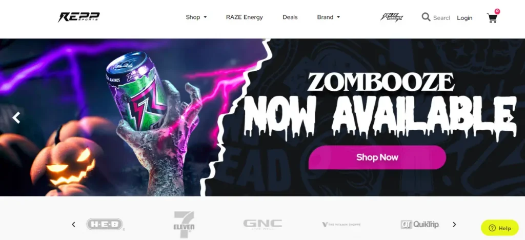
This is an excellent example of a site with strong branding:

You’ll notice the blue and grey color scheme and clean structure as you navigate the site. Their website is modern, with a bright, airy feeling, and all of their imagery is original.
4. Simple Navigation
When it comes to website menus, there are several alternatives. You can have a drop-down menu, a scroll-triggered menu, a hamburger menu, and so on. It makes little difference in the style you use; what matters is that it allows visitors to easily discover what they need on your site. Your navigation should be simple and intuitive in terms of both design and page organization.
Take a look at the Accurate Tax navigation:

The most significant pages have their own navigation bar items and dropdowns with the most important supporting information. Even at a glance, it’s simple to find what you’re searching for. Remember that consumers like to access information fast and effortlessly. The more you can accomplish in this regard, the more successful you will be.
5. Easy-to-Find Contact Information
How do you expect individuals to contact you if their contact information is unavailable? You don’t want to lose a potential customer just because they can’t find a way to contact you. Aside from having your contact information easily accessible, you should also provide customers with other options to reach you. A phone call, an email, or an online form are all acceptable options.
6. Strong Calls to Action
This is related to the first point we made about making your visitor’s next action clear. A call to action should instruct your reader on what to do and, if possible, what they will gain from doing so.
An accountant, for example, may have a call to action that says, “Simplify your taxes by arranging an appointment with us now.” People understand what you’re asking them to accomplish and what they’ll get from it.
Another strategy to boost conversions is to strategically place CTAs in your content. This basic button is appealing without being overbearing:

You don’t want to overload people with information or be overly showy, since this may turn them off and drive them to leave your site. You must strike the appropriate balance in order to attract clients without being too aggressive.
7. A Great Mobile Experience
Because mobile traffic accounts for over half of all online traffic, a solid mobile experience is critical. Visitors will leave if your site does not load promptly and provides a pleasant user experience. Those visitors are unlikely to return since they will locate another site that provides a better experience.
You should ensure that your web design Business produces responsive websites. Responsive web design ensures that your site looks and performs properly on any device, whether a computer, tablet or phone.
8. Compelling Content
If you want people to come to your website, give them something helpful. Nobody wants to waste time browsing over a few pages. They want to see useful stuff that they can take with them when they leave your website. Content drives visitors to your website, whether through search engines or social networking platforms.
However, you cannot simply publish anything and call it a day. It is critical that your content is relevant to your consumer, informative, and search engine optimized. Consider what your ideal consumer would like to know about your products/services and build pages and blog articles around these themes. As you can expect, generating strong SEO content is difficult. It has to be discoverable. That is why so many individuals engage content creators from digital marketing organizations!
9. Rave Reviews
Let’s face it: consumers read reviews and base many of their purchasing decisions on them. So, if you have positive feedback, you want visitors to see it when they visit your website. This will offer them confidence in your company’s reputation. It may also encourage them to post a similar review after doing business with you and having a positive experience.
10. Google Analytics
While it is technically possible to operate a commercial website without Google Analytics, we do not suggest it. Google Analytics provides a wealth of information about your website’s traffic and visitors. You’ll learn about your users and better target your marketing efforts to them by tracking everything from traffic source to OS system utilized by your visitors. You may also establish goals, such as a visitor making a phone call or completing a contact form, and measure whether or not you meet those goals each month (or week).
The best part? Google Analytics is a fully free service.
Setting up Google Analytics is straightforward, but things like goal monitoring are more difficult. Trying to decode all of the data can also be difficult, but after you’ve figured out how to use Analytics (or hire a company to do it for you), you’ll wonder what you did without it!

How Many of These Does Your Business Website Have?
We can assist you if your website lacks one or more of the components on this list. For over 5 years, ARF Services has been designing and promoting websites for companies like yours. To get started, get your free site assessment or call us at
+92 (309) 514-8449!


